Ever walked into a room and felt instantly relaxed, without quite knowing why? Or the opposite — a space that just felt off, even though the furniture was perfectly nice? There’s a decent chance colour had a lot to do with it. Color psychology interior design isn’t some abstract art-school theory — it’s genuinely practical stuff that affects how you feel in a room every single day. I’ve repainted rooms purely based on how they made me feel, not just how they looked in photos, and the difference is real. Let’s break down which colours actually do what, and how to pick a palette that fits your life, not just a Pinterest board, in 2026.
Why Color Psychology Actually Matters at Home
This isn’t just decorating theory dressed up to sound scientific — there’s genuine psychological research behind how colour affects mood.
Quick answer: Color psychology in interior design refers to how different hues influence mood, energy levels, and behaviour within a space. Warm colours like red and orange tend to energise, while cool colours like blue and green promote calm — understanding this helps you choose paint and decor that support how you actually want to feel in each room.
Colour affects us on a level most people don’t consciously register. Warm tones can genuinely raise your heart rate slightly and make a room feel more social and energetic. Cool tones tend to slow things down, which is exactly why so many bedrooms lean toward blues and soft greens rather than bright red or orange.
There’s also a cultural layer worth mentioning, especially in an Indian context. Colours carry meaning here that goes beyond pure psychology — red signifies auspiciousness and celebration, yellow is tied to knowledge and positivity, and white often carries more formal or even mourning associations in certain regional traditions. I’ve noticed a lot of generic Western colour psychology guides completely skip this, which honestly makes them less useful for Indian homes.
None of this means you need a psychology degree to decorate well. It just means the colour choice deserves a bit more thought than “I like this shade” — though liking it genuinely matters too, don’t discount that.
Warm Colors and the Energy They Bring
Reds, oranges, and yellows fall into the warm category, and they do exactly what the name suggests — they warm up a space, both visually and emotionally.
Red is intense. It raises energy, appetite, and social interaction, which is why it works so well in dining rooms but can feel overwhelming in a bedroom where you actually want to wind down. A full red bedroom sounds bold in theory, but I’ve seen people regret it within a few months once the novelty wears off.
Orange carries similar energy but feels friendlier, less aggressive than red. It’s a strong choice for kitchens or casual dining spaces, especially in smaller doses like an accent wall or décor pieces rather than covering an entire room.
Yellow brings warmth and optimism without red’s intensity. A soft, muted yellow works beautifully in kitchens or hallways, though bright, saturated yellow can get genuinely tiring in large doses — it’s a colour that works best used thoughtfully, not everywhere.
A few practical ways to use warm colours without overwhelming a space:
- Reserve intense warm shades for accent walls, not entire rooms
- Pair warm colours with neutral furniture to balance the visual energy
- Use warm tones in social spaces (dining rooms, kitchens, living rooms) rather than rest spaces
- Consider muted, earthy versions of warm colours — terracotta instead of pure red, mustard instead of bright yellow — for a softer effect that suits Indian light conditions well
Cool Colors and Their Calming Effect
Blues, greens, and purples sit on the cool end, and they’re the go-to choice when calm matters more than energy.
Blue is probably the most universally calming colour in interior design, and there’s decent research backing that up. Soft, muted blues in bedrooms genuinely seem to support better rest — I’ve noticed this myself after repainting a bedroom from a warm beige to a soft dusty blue a few years back. Sleep quality is hard to measure precisely, but the room definitely felt calmer to be in.
Green connects to nature and tends to feel grounding and restorative, which makes it a strong choice for living rooms or home offices where you want calm focus rather than pure relaxation.
Purple, especially in its softer lavender or mauve forms, carries a slightly more luxurious, contemplative feel. Deep, saturated purple can feel heavy in a small room, though, so it’s worth using carefully.
A quick breakdown of where cool colours work best:
- Bedrooms — soft blues and muted greens support rest and lower visual stimulation before sleep
- Home offices or study corners — green in particular seems to support sustained focus better than warmer, more stimulating shades
- Bathrooms — cool tones pair naturally with the calm, clean feeling most people want in this space
- Meditation or puja corners — soft blues, whites, or pale greens suit the quieter mood these spaces usually call for
Neutral Colors: The Underrated Foundation
Neutrals don’t get nearly enough credit in colour psychology conversations, probably because “beige” doesn’t sound as exciting as “energising red.”
Quick answer: Neutral colors like white, beige, and grey provide a calm, flexible foundation that lets other design elements — furniture, art, accent colours — stand out without visual competition. They also reflect light well, making rooms feel larger and brighter, which matters a lot in smaller Indian homes.
White creates a genuine sense of openness and cleanliness, though pure white can feel a bit cold or clinical without warmer accents layered in through furniture, textiles, or wood tones.
Beige and warm greys strike a nice middle ground — neutral enough to be flexible, but with enough warmth to avoid feeling sterile. Honestly, this is probably my personal favourite base for most rooms, precisely because it doesn’t force a strong mood either way; it just lets the room adapt to whatever you’re using it for that day.
Grey has become genuinely popular in newer Indian homes over the past several years, particularly in urban apartments. It reads as modern and sophisticated, though I’d argue it needs warmer accents — wood, brass, warm lighting — or it can tip into feeling a bit flat and impersonal.
Choosing Colors Room by Room
Different rooms serve different psychological purposes, so the palette should genuinely shift room to room rather than staying uniform throughout the house.
Bedrooms benefit most from cool, muted tones — soft blues, sage greens, gentle lavenders — that support rest rather than stimulation. Avoid bright, saturated colours here even if you love them elsewhere in the house.
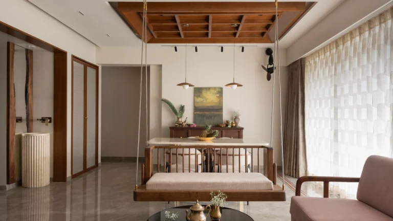
Living rooms can handle more variety since they serve multiple purposes — socialising, relaxing, sometimes working. A neutral base with one warmer accent colour (terracotta, mustard, deep green) often works best here.
Kitchens do well with warm, appetite-stimulating colours — soft yellows, warm whites, even the occasional red accent — since these genuinely seem to make food feel more inviting, which is well-documented in colour psychology circles.
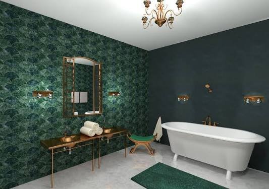
Bathrooms lean toward cool, clean tones — soft blues, whites, pale greens — that reinforce that fresh, calm feeling most people want from this space.
Children’s rooms are a bit of a special case. Overly stimulating bright colours everywhere can actually make it harder for kids to wind down at bedtime, so I’d suggest one accent wall in a fun, energetic colour paired with calmer tones elsewhere in the room. [link to related guide on how long interior paint lasts here — worth knowing before committing to a bold kids’ room colour]
Common Color Psychology Mistakes People Make
A few patterns show up again and again when people try to apply colour psychology at home, and most are easily avoidable.
The biggest one, honestly? Choosing a colour purely because it’s trending, without considering how the room is actually used. A gorgeous deep navy might look stunning on Instagram, but if it makes your small bedroom feel cave-like and closed in, the trend isn’t worth the daily experience of living with it.
Other mistakes worth watching for:
- Using too many strong colours across one open-plan space, which creates visual chaos rather than distinct, intentional zones
- Ignoring natural light levels — a cool grey that looks sophisticated in a bright, south-facing room can feel genuinely gloomy in a north-facing room with less light
- Forgetting that paint colour looks different at different times of day — always test samples in both morning and evening light before committing
- Matching colour purely to furniture trends rather than personal comfort — a colour scheme should serve how you actually want to feel, not just what’s currently fashionable
Has this ever happened to you — painted a room a colour you loved on the swatch, only to feel strangely unsettled once it covered every wall? That’s usually colour psychology working against you rather than for you, and it’s a genuinely common experience, more common than people admit.
Building a Cohesive Palette Across Your Whole Home
Individual rooms matter, but there’s real value in thinking about how colours flow between spaces too, especially in open-plan Indian flats where rooms often connect visually.
Quick answer: A cohesive whole-home palette typically uses one consistent neutral base throughout, with each room introducing its own accent color that still feels connected to the overall scheme — this creates flow between spaces without every room looking identical.
Pick a neutral base — warm white, soft beige, light grey — and carry it through hallways and connecting spaces. Then let each room introduce its own accent colour on top of that shared foundation.
This approach solves a common problem in smaller flats where rooms are visible from each other — an overly disjointed colour scheme between adjoining spaces can make the whole home feel choppy and smaller than it actually is, even if each individual room looks fine on its own. [link to related guide on best exterior paint colors that increase home value here — the same cohesion principle applies moving from exterior to interior]
FAQs About Color Psychology in Interior Design
What color psychology interior design tips work best for small Indian homes? Light, warm neutrals as a base with a single accent colour per room tend to work best, since they keep small spaces feeling open while still allowing some personality and mood variation.
Which colors are best for a calming bedroom? Soft, muted blues, sage greens, and gentle lavenders are consistently the top choices for bedrooms, since cool tones support rest better than warm, stimulating shades.
Does color psychology in home design vary by culture in India? Yes, genuinely. Colours like red and yellow carry auspicious, celebratory meaning in Indian tradition beyond their pure psychological effects, which is worth factoring in alongside general colour theory.
Can the wrong wall color actually affect my mood daily? It can, especially in rooms you spend a lot of time in. A colour that’s too stimulating in a bedroom, or too cold in a social space, genuinely affects how comfortable you feel there long-term.
Should every room in my house use the same color scheme? Not necessarily identical, but a shared neutral base with room-specific accents creates a cohesive flow, especially important in open-plan or smaller flats where rooms are visually connected.
What’s the best color for a small home office to improve focus? Muted greens or soft blues tend to support sustained concentration better than bright, high-energy colours, which can actually become distracting during long work sessions.
Final Thoughts
Color psychology interior design principles genuinely help you build a home that supports how you want to feel, room by room, rather than just chasing whatever’s trending this season. Warm tones energise, cool tones calm, and neutrals give you the flexible foundation to tie it all together — the trick is matching the colour to the room’s actual purpose, not just the mood board.
Before your next repaint, spend a week paying attention to how each room in your home actually makes you feel right now. That honest observation will guide your palette choices far better than any trend list, mine included.